
Most WordPress charts are static PNG images that readers scroll past, but animated SVG charts perform far better for engagement and load faster than the static screenshots they replace.
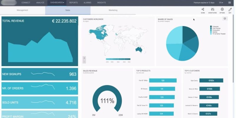
Open almost any WordPress article that includes data and you will see the same thing: a chart that is really just a screenshot. Someone made it in a spreadsheet or a design tool, exported a PNG, and dropped it into a Media block. It does the job, technically. It also gets scrolled past, sits there as dead weight on mobile, and quietly drags down the two things that matter most for a content site, which are how long readers stay and how fast the page loads.
Data visualisation in WordPress is one of those areas where the default habit is the worst option, and almost nobody questions it. This piece looks at why static images underperform, where the different categories of tooling actually differ, and what changes when a chart becomes interactive or animated instead of frozen.
The problem with the screenshot chart
A static image chart has three quiet costs. The first is engagement. A picture of data asks nothing of the reader, gives them no reason to slow down, and offers no payoff for paying attention. Eye-tracking and scroll-depth studies have consistently shown that readers skim past static figures unless something pulls them in. A chart that simply sits there is competing with every other static block on the page, and losing.
The second cost is responsiveness. A PNG exported at desktop width either overflows or shrinks to an illegible postage stamp on a phone, and a huge share of your traffic is on a phone. Text inside the image does not reflow, so the labels that were perfectly readable on your laptop become a blur. You cannot fix this with CSS because there is nothing semantic to style. It is a flat picture.
The third cost is performance and accessibility together. A high-resolution chart image can be hundreds of kilobytes, it carries no machine-readable data, and a screen reader gets nothing from it beyond whatever alt text you remembered to write. You are shipping weight and giving back very little.
The three categories people confuse
When folks go looking for a better way to show data in WordPress, they tend to lump every plugin into one bucket. It helps to separate them, because they solve different problems.
Table plugins are for tabular data: sortable, searchable rows and columns, like a comparison of plans or a directory of specs. Some can render a basic chart from the table, but their heart is the table itself. If your data is fundamentally a list of rows, this is your category, and a chart is a nice secondary view.
Chart plugins are for turning numbers into bars, lines, and pies. The serious ones connect to a data source, support many chart types, and can update on a schedule. They are powerful and they are heavy, because most of them bundle a full JavaScript charting library and load it widely across your site. If your figures genuinely change and need to re-render from live data, this is the right tool and the weight is the price of the feature.
Data-visualisation approaches are the broader bucket: the goal is communication, not just plotting. This includes infographics, scroll-paced reveals, animated diagrams, and any visual designed to make a point land rather than just display values. For the typical content article, where the chart exists to explain something inside the writing, this is usually the category that fits, and it is the one most people skip straight past on their way to a heavyweight chart plugin.
Why interactive and animated visuals perform differently
The interesting part is what happens to your metrics when a chart stops being a frozen picture. An animated chart that draws itself as the reader scrolls to it does something a static image cannot: it creates a small moment of motion that the eye is wired to follow. That motion gives the reader a reason to pause, and a pause is dwell time. On a content site, dwell time and scroll depth are leading indicators of the engagement signals that correlate with better rankings and better ad or affiliate performance.
> The short version: Animated charts increase dwell time and comprehension by drawing the eye during scroll, and SVG-based animation does all this while loading lighter and faster than static image alternatives.
Interactivity adds a second layer. When a reader can hover for a value, toggle a series, or watch a sequence reveal step by step, they are participating instead of glancing. Participation is sticky. It is the difference between showing someone a conclusion and walking them through how you got there.
None of this requires sacrificing speed, which is the part people get wrong. The instinct is that interactive equals heavy, but that is only true when the chart is built on a bulky canvas library. Charts rendered as lightweight SVG are just markup: they scale crisply on any screen, animate with CSS rather than a runtime parsing hundreds of kilobytes on the main thread, and stay accessible because the elements live in the DOM. Done this way, an animated chart can be lighter than the PNG it replaces while doing far more for engagement.
What this looks like in practice on WordPress
Concretely, the upgrade path is not as involved as it sounds. The goal is a chart that is responsive by default, animates on scroll, follows your site’s light or dark theme, and only loads where it is actually used rather than enqueueing scripts site-wide. That last point matters a lot for Core Web Vitals, because the classic chart-plugin failure mode is loading a charting library on your contact page and your archives, pages that contain no chart at all.
This is the niche that an animated-chart plugin for WordPress is designed to fill. The approach is lightweight SVG charts in the range of twenty to thirty kilobytes each, deferred below the fold so they do not block your largest contentful paint, with the same catalogue picker and live preview surfaced through a Gutenberg block, a Classic Editor shortcode, a WPBakery element, and an Elementor widget. The result is that the convenience of an in-editor tool does not come bundled with the page-weight penalty that usually rides along with chart plugins.
How to choose without overthinking it
If your data is a sortable list, use a table plugin and treat any chart it offers as a bonus. If your figures are live and must re-render from a connected source, accept a full chart plugin and the weight that comes with it, because you are using the feature you are paying for. But if your charts exist to explain a point inside an article, which is the overwhelmingly common case, reach for the data-visualisation approach: interactive or animated SVG that earns attention, reflows on mobile, and stays light. The static screenshot was never free. It just hid its costs in metrics you were not watching. For a sense of how broad the interactive catalogue can be, the free library at scrollchart.com is worth a browse before you settle on a method.
Frequently asked questions
What makes animated charts better than static images for engagement?
Animation creates a moment of motion that the eye follows, giving readers a reason to pause and spend time with the data. This dwell time signals engagement to ranking algorithms and correlates with better affiliate and ad performance. Scrollchart charts animate as readers scroll, creating that moment of pause without requiring any action from the reader.
Do animated SVG charts load slower than static PNG screenshots?
No. Lightweight SVG charts are typically twenty to thirty kilobytes and load faster than high-resolution PNG screenshots of the same data. Because they are rendered in the DOM rather than parsed by a heavy JavaScript runtime, they do not block your page performance metrics like largest contentful paint.
Can I use interactive charts on WordPress without a heavyweight plugin?
Yes. Lightweight animated SVG charts load only on pages that contain them and do not enqueue scripts site-wide. This approach keeps your Core Web Vitals intact while adding the engagement and accessibility benefits of interactive, responsive visualisation that static images cannot offer.


Comments